The Big Life Project: A repositioning case study
How we repositioned a former Global Director's coaching practice, from a generic "life and career coach" listing in a crowded Dublin market into a defensible, framework-led brand with a clear pathway for both individual and corporate buyers.
The work was delivered through the Brand Authority Method™ - my six-step framework that runs strategy, visual identity and digital design build from the same strategic foundation.
For Lindsay, this engagement covered five of the six steps: strategy, visual identity, copy, and website build. Brand photography wasn't part of the scope, as Lindsay already had an image library from earlier work.
The Starting Point
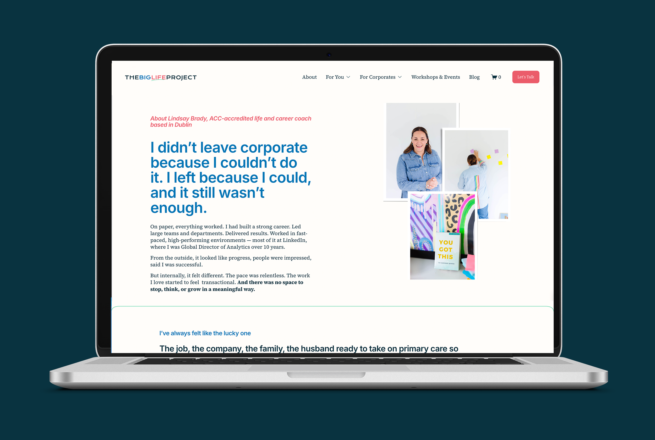
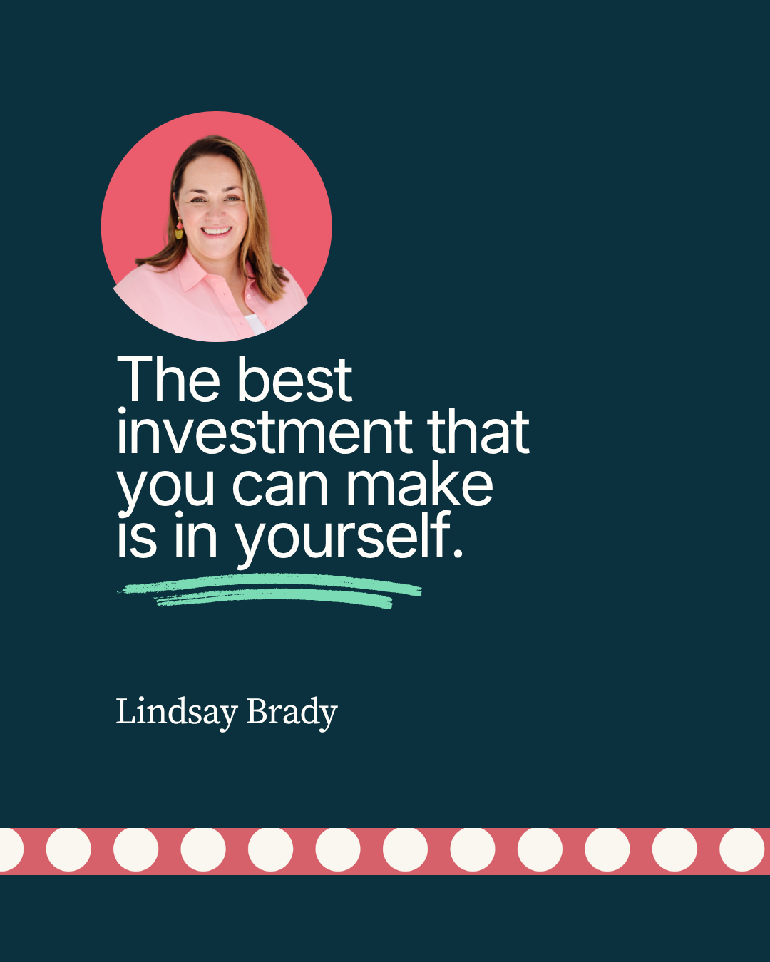
Lindsay Brady came to me a year into building The Big Life Project, the coaching practice she founded after twenty years in senior leadership, most of them as a Global Director at LinkedIn.
She had everything you'd want a coaching founder to have. An ACC accreditation. Hundreds of supervised hours. Certifications in Co-Active and group coaching. A LEGO® SERIOUS PLAY® qualification. A fluent corporate background. Real testimonials. Two clear audiences: individuals and the companies who sponsor them. And a values framework she'd already articulated for herself.
What she didn't have was a way to organise any of it.
Her existing site was founder-built. The design was capable, but the strategy underneath it wasn't there yet. The copy carried too many ideas. The offering names kept shifting. Her positioning sat inside the same generic "life and career coach" category as dozens of competitors in Dublin, none of whom had her credentials, and none of whom she had a way to distinguish herself from.
In the language I use for this work: Lindsay's business had outgrown her brand. The expertise was real. The credentials were substantial. But the brand belonged to an earlier, smaller version of what she was building. It wasn't a design problem. It was a brand authority problem, and surface-level fixes wouldn't have closed the gap.
This is exactly the moment the Brand Authority Method is built for.
The Approach
The Brand Authority Method runs through six steps, in deliberate order. Strategy first, always. Every subsequent step is an expression of what the strategy reveals, not a separate project running in parallel. The six steps are: Brand Strategy, Visual Identity Design, Brand Photography, Website Copy, Website Design & Build, and post-launch training and handover.
For Lindsay's engagement, we worked through five of the six. Brand Photography wasn't part of the scope as she already had a strong image library that fit the new direction once we'd defined it.
I'll walk through each step as it applied to The Big Life Project.
Step 1: Brand Strategy
The strategy stage runs across five focused sessions, each one a structured Zoom workshop with the founder, paired with research and analysis between sessions. The five sessions cover Purpose, Personality, People, Positioning and next-steps planning.
Purpose
The Purpose session started with the founder story. Lindsay's story is unusually rich: twenty years at LinkedIn, promoted to director while on maternity leave, keynoting to 3,000 from a Post-it on the train, the broken shoulder running to a meeting, the mid-life uplevel that became The Big Life Project. The work wasn't extracting the story; the story was already there. The work was deciding which parts of it the brand should illuminate, and why.
We landed on three statements that anchor the brand:
Vision. A world where people choose their lives deliberately, not by default, and not because something broke first.
Mission. To coach managers and professionals through the moments that matter, so they make decisions from a place of clarity and self-knowledge, not fear, expectation, or someone else's idea of what success looks like.
Purpose. To prove that the most important decision you will ever make at work is the one nobody else can make for you.
The Purpose session also surfaced the one-word brand essence: Fairness. Not the word a marketer would have picked. The word that explained what triggers Lindsay about how managers are promoted, how professionals are expected to navigate transitions, how careers get shaped by default rather than design. Naming Fairness as the essence gave us a single filter to run every subsequent decision through.
Personality
The Personality session developed the brand's voice and behaviour, how it sounds in a discovery call, in a LinkedIn post, in a workshop, in a room of strangers.
We landed on six personality traits, each one expanded into what it means in practice.
Underneath those, we built a tone of voice document covering language that works and language to avoid. Specific enough that anyone writing for the brand could check their draft against it.
We also did "if our brand was..." exercises - a destination, an animal, a shoe, an instrument. These sound playful and they are. They also produce sharper brand definition than abstract values lists do and each one carries a specific argument about how the brand should feel.
People
The People session was the most research-heavy. Lindsay had two distinct buyer types — individuals making personal coaching decisions, and corporate sponsors (HR, L&D, Heads of Business) buying for their teams. Getting this right was non-negotiable, because the dual-audience problem was the central commercial challenge of the brand.
The People session ran on three streams of input.
The first was voice-of-customer research, primarily conducted by Lindsay with her past clients. I designed the questions; Lindsay did the interviews. We chose this division deliberately — past clients would speak more openly with Lindsay than with me, and Lindsay's lived experience with them meant she could follow useful threads in a way an outside researcher couldn't. The questions were structured to surface the specific language clients used about their before-and-after, the words they reached for unprompted, the things they only realised retrospectively. That language went straight into the brand voice work.
The second was market and audience research through Enfuse, the Dublin City Local Enterprise Office programme. We worked with a student research team as part of that engagement to extend the audience analysis beyond what one practitioner could do alone. The student team gave us breadth, competitor mapping across the Dublin and Ireland coaching market, market sizing for the corporate buyer segment, secondary research on the under-supported manager population Lindsay had identified as her priority audience.
The third was persona development, building structured personas for both buyer types: the individual buyer and the corporate buyer. We mapped a day in their life, the channels they used, the things they cared about.
The clearest commercial output of the People session was confirming the corporate buyer hypothesis. There was a real market for Lindsay's expertise on the under-supported manager population, a need her senior leadership background uniquely qualified her to address. That finding shaped everything that followed.
Positioning
The Positioning session pulled everything together. We started with a competitive analysis across the Dublin and Ireland coaching market — the senior executive coaches, the life-design practitioners, the leadership consultants. Each one strong in its own way, each one largely interchangeable in the buyer's mind. None of them owned a specific audience, a specific transition, or a specific point of view.
From there, we mapped Lindsay's differentiators across the 4Ps: product, price, place and promotion. Each one had a specific competitive lens. From the 4Ps work, we wrote the positioning statement and the brand promise.
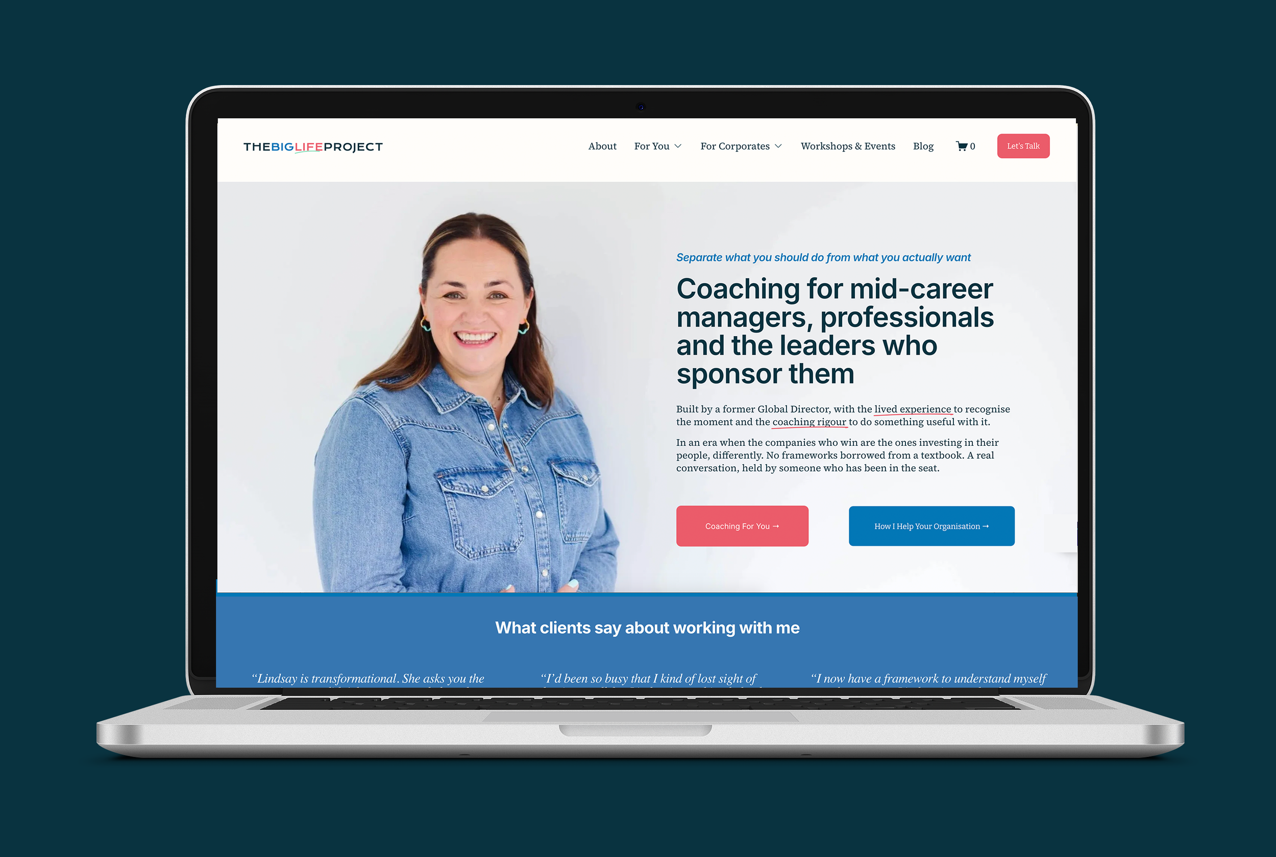
The most consequential strategic decision came at this stage. Lindsay had been using a framework with clients, but it wasn't named anywhere on her site. I argued for making it the brand spine: the recurring idea every page returns to, the phrase that becomes synonymous with Lindsay's name in the market. Naming the framework explicitly turns a methodology she does into intellectual property she owns. Same coaching work, packaged in a way prospects can remember, recommend, and search for.
That decision is what allowed us to resolve the dual-audience problem at the positioning layer, not the page layer. The individual buyer wrestling with a should-vs-want decision is the same person the corporate buyer is trying to develop. Once we positioned the brand around the decision itself, both audiences found themselves in the same sentence. The brand stopped being two things bolted together. It became one thing with two doors.
Next-steps planning
The fifth strategy session closed the stage with a planning conversation. We identified the three brand challenges the work needed to solve, and built the case for how the design, copy and web work would address each. Those three challenges became the brief the rest of the engagement was held against.
This session is also where we agreed scope and sequencing for the design and build phases, and clarified that brand photography wasn't needed because Lindsay's existing library would carry the new direction once we'd defined it.
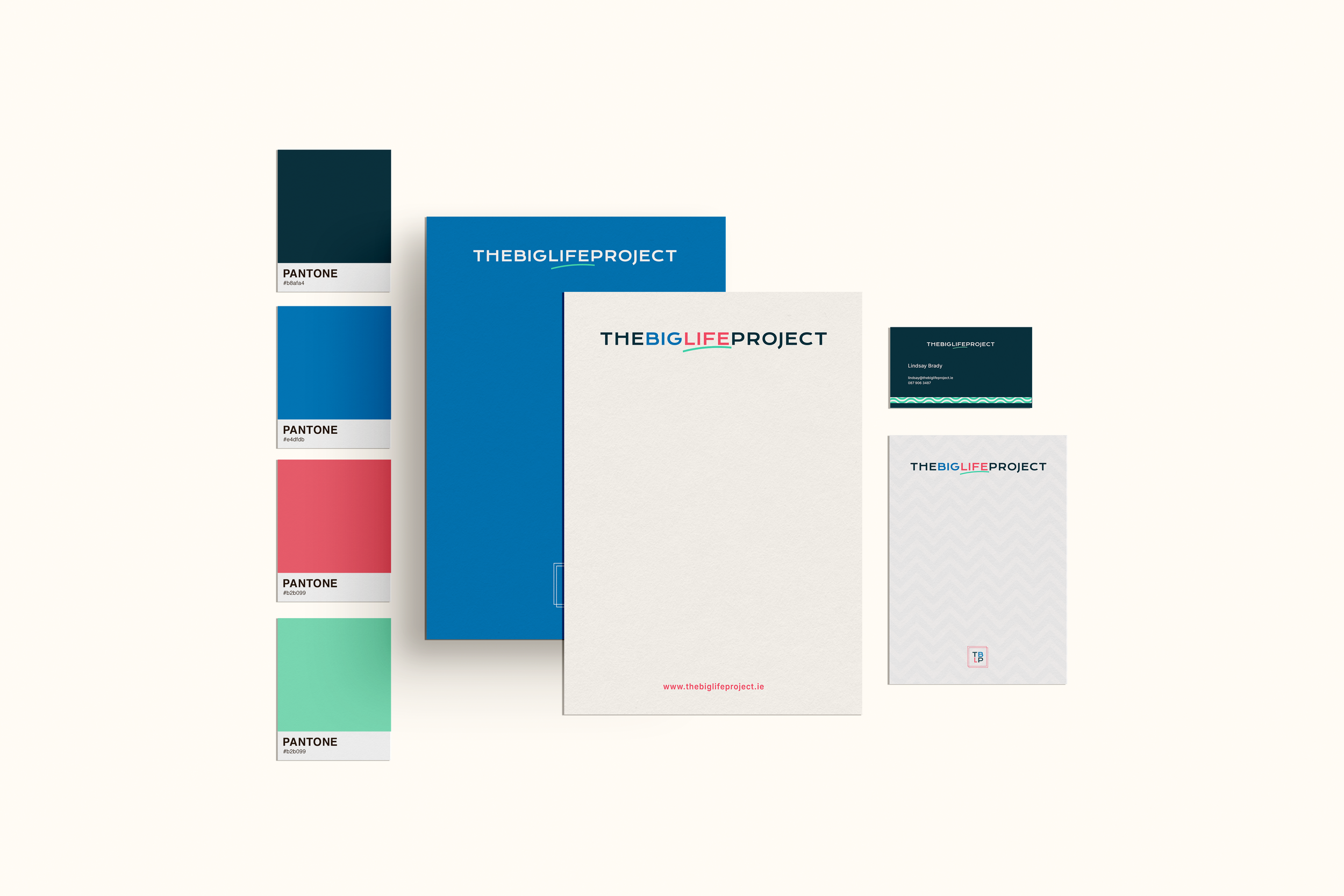
Step 2: Visual Identity Design
The visual identity work began inside the Positioning session, with the brand promise translated explicitly into visual direction.
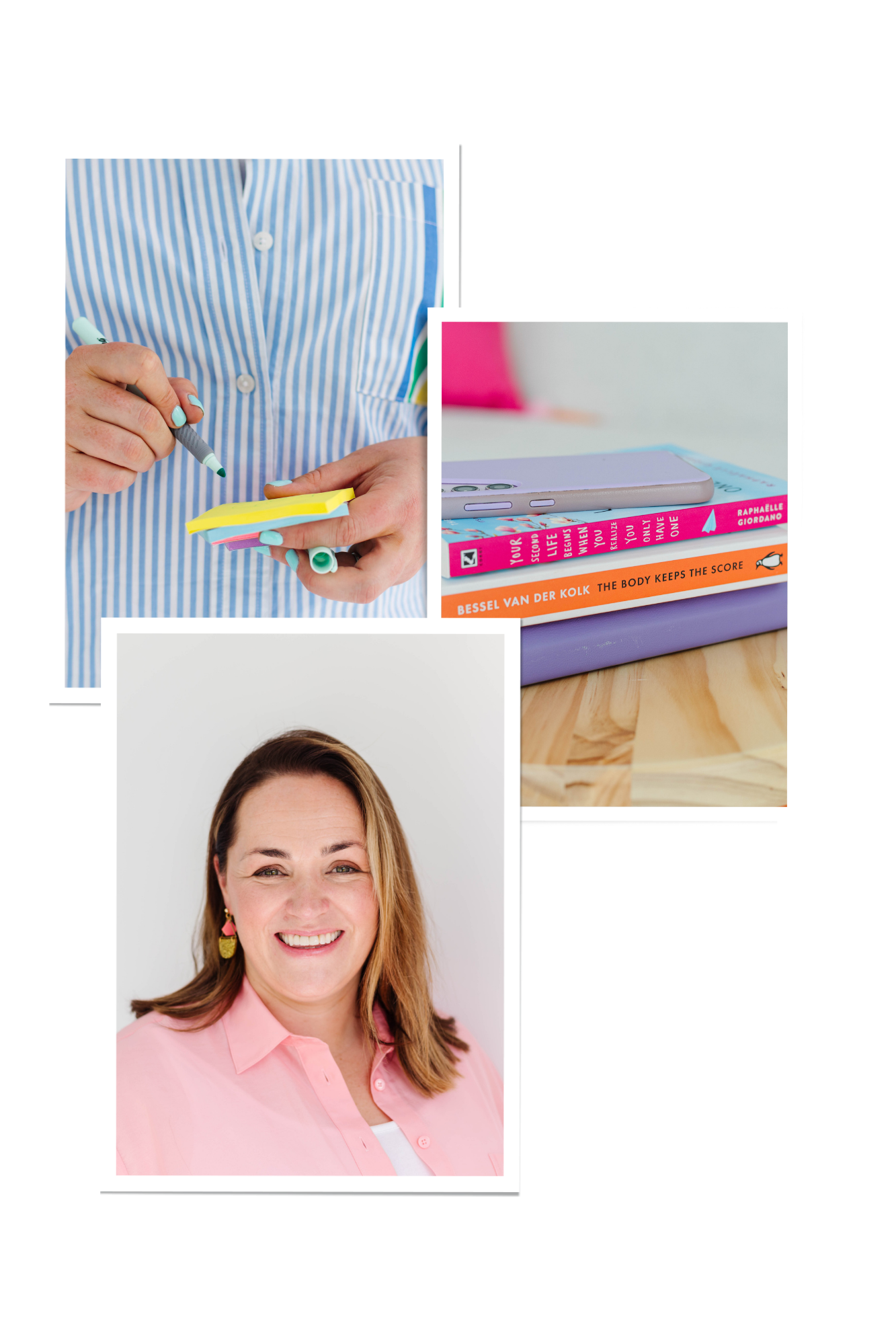
The brand promise (you will leave knowing what you actually want, and trusting yourself enough to go after it) gave us the core visual metaphor: a person taking up space they were not sure they were allowed to take. Shoulders back. Feet planted. Not performing confidence, just present. A secondary metaphor, the clearing. Not a destination, not a dramatic before/after. Space to breathe, see, and decide.
We wrote a photography brief from those metaphors that Lindsay used to direct her existing image library, plus a single visual test that became the filter for every subsequent design decision: Does this make the viewer feel like they are allowed to take up space they were not sure they could take? If yes, it's right for the brand. If it makes them feel processed, sold to, or impressed at, it's wrong, however professional it looks.
The design language followed. We needed a system that held the warmth Lindsay's clients describe unprompted, and the seniority her corporate buyers need to see in the first ten seconds. The palette, typography and visual marks balance the two. The brand reads as quietly confident in the rooms it needs to win in, and warm in the conversations it needs to hold. Quiet confidence, with a good dose of colour, was the brand trait we were closing the gap on, and the visual system follows the same logic.
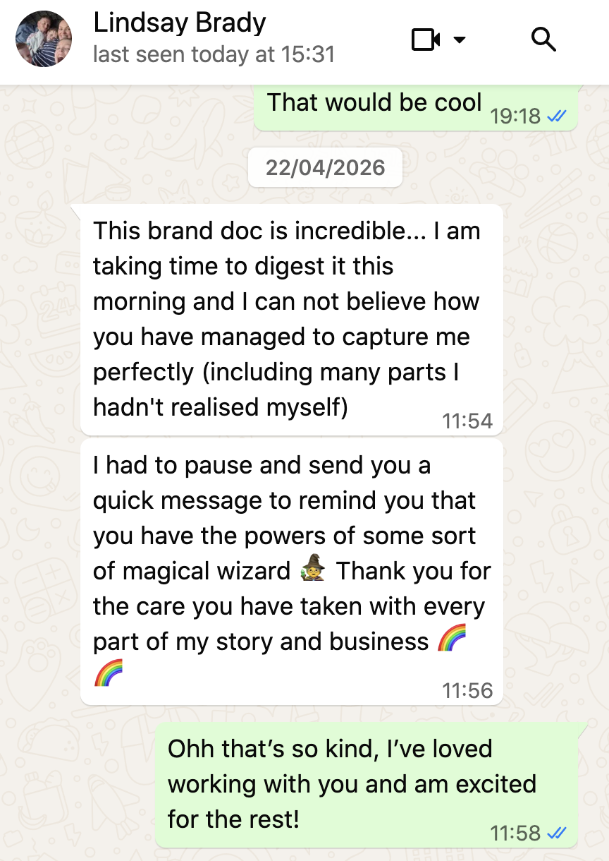
“Is there anything harder than describing yourself? 🙃
Working with Lucy was the best gift I could have given The Big Life Project this year. I was nervous about the investment & handing over control but Lucy guided me through the process step by step and showed me and my business nothing but care, respect and deep thought... and the results speak for themselves.”
Step 4: Website Copy
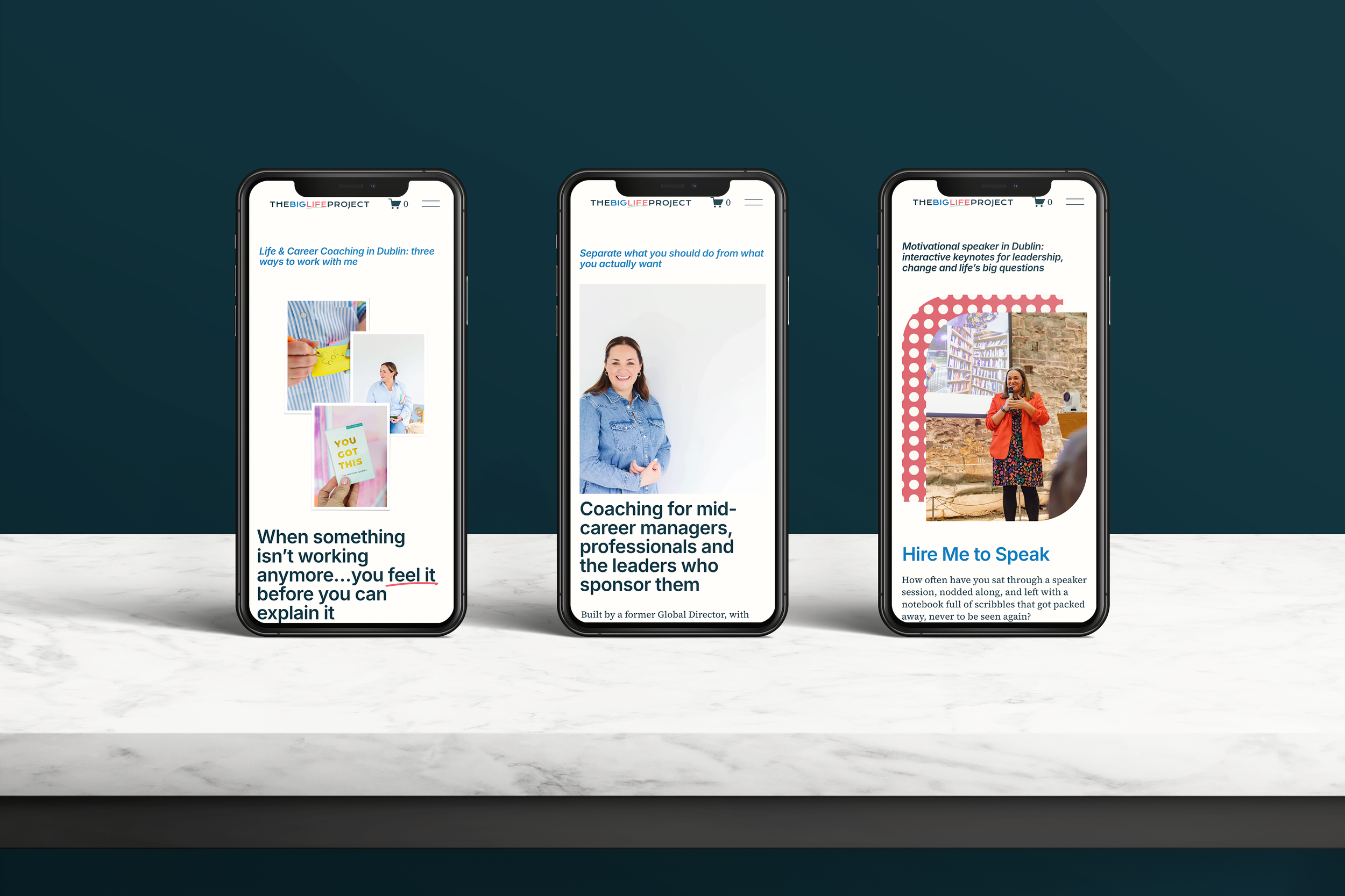
I wrote the full site myself for this engagement. The standard Method scope is up to eight pages; for Lindsay we scoped thirteen, because the dual-audience structure needed clearly separated paths for individual and corporate buyers — three pages on each side, plus a homepage that holds both, plus About, Events, Contact and a few service-specific destinations.
The homepage opens with the strategic claim — separate what you should do from what you actually want — and the audience qualifier in the same fold, so both buyers find themselves within five seconds. Every page below pulls one thread from the positioning statement and lets it lead. SEO keywords were mapped against each page using a keyword research report we'd commissioned in parallel: SEO-led H2s capturing the search visibility, brand-led H2s protecting the voice, SEO-led H2s capturing the search visibility. Brand and SEO doing their respective jobs without arguing.
A consistent pattern across the site: brand language above the fold, specifics below. The reader who has already decided gets to act fast; the reader who needs more substance keeps reading. Both paths converge at the same calls-to-action.
Step 5: Website Design & Build
The site was designed to make the new copy work. Hierarchy, breathing room, deliberate restraint on the homepage hero. Two clear paths from the landing page, one for individuals, one for organisations, with separate calls-to-action that respect the difference between a personal decision and a corporate budget. Every page is built to do one job for one reader.
The visual test we wrote during the strategy stage - does this make the viewer feel allowed to take up space? - became the design filter for every page.
What the brand strategy was built to solve
A brand strategy isn't a deliverable. It's a tool for solving identified business problems. Three specific challenges sat behind the work, and every decision was traceable to one of them.
Visibility without volume. Lindsay is a sole practitioner with a coaching practice to run. The risk wasn't lack of content ideas — it was inconsistency. The strategy addressed this by building a content-able brand: a clear framework (Should vs Want), a clear founder story, a clear set of recurring phrases. Lindsay can write a LinkedIn post in fifteen minutes now because the language is decided, not invented each time.
Credibility at first glance. The warmth was already visible. The twenty years in senior leadership, the LinkedIn director role, the team of fifty, founder of Families at LinkedIn - none of that was visible unless someone went looking. The strategy resolved this by leading every key surface (website hero, About page, LinkedIn bio, speaker proposals) with the senior credibility, then letting the warmth do the second half of the work. Corporate buyers now land in the credibility within ten seconds. Individual buyers still find the warmth.
Turning clients into advocates. Lindsay's strongest growth lever is word of mouth, confirmed by the research, the testimonials and the nature of the work. The strategy built the conditions for advocacy to compound: a named framework that gives past clients something specific to say, a group programme designed with community at its core, an offboarding rhythm that turns engagements into ongoing relationships. The system that turns individual transformation into collective momentum.
What changed
Before. A founder-built site that read as "another Dublin life coach." Substantial credentials buried below the fold. No framework articulated. Audience confusion in the navigation. Search terms underused. The brand was working harder than it should have been to explain itself.
After. A positioning that names the rare combination Lindsay actually offers: lived senior leadership experience and rigorous coaching credentials, with a proprietary framework, methodology and group community model. A clear pathway for both individual and corporate buyers. One framework, one brand spine, two audiences, one site.
The work is doing what it needs to do. Lindsay has a brand she can run her business from. She can explain what she does in one sentence and have both a manager and a Head of HR recognise themselves in it. She has the materials to walk into a corporate scoping call and a consumer discovery call with the same confidence. The three challenges the strategy was built to solve are now being actively addressed by the system, not worked around.