Colour Pyschology & how to choose the right colours for your brand.
Imagine a completely colourless world; everything from the food we eat, the clothes we wear, to our environment.
How would that make you feel?...
Would it spark your creativity? Would it impact your mood and overall wellbeing? How motivated or inspired would you feel throughout your day?
The thing is, humans are visual creatures, and our instinct is to gravitate toward colour. Colours can affect our mood, actions, and perceptions – so it’s no wonder it’s one of the most important factors in branding.
For brand designers, colour choice is driven by a brand’s core purpose and stems from the premise that colour can enhance identity. Calm and sophisticated neutral hues might work well for some, while others might shine best with a punchier palette.
So, how can you harness the power of colour psychology for your brand’s visual identity? Let’s take a look.
What is colour psychology?
Colour psychology is the study and application of colour and how it relates to us psychologically, scientifically and creatively. It is the study of hues and how they affect human behaviour and is based on the understanding that colours have the power to influence our emotions, feelings and actions, often at a subconscious level.
In the marketing and branding world specifically, colour psychology focuses on how specific colours influence a customer's impression of a brand and how that impacts their purchase decision.
Whether it’s your logo, website, packaging or shopfront, colour is often the first thing that pops out to consumers when interacting with a brand.
With this in mind, the colours brand designers choose for a business can have a significant impact.
When used correctly, the right colours can
Bring clarity, confidence and resonance to your brand visual identity
Help you articulate the ‘why’ behind your brand and give direction to your visual branding and marketing strategy
Evoke feelings and emotions in your audience that, in turn, spark decisive action. In fact, studies have shown that colour can influence 85% of customers’ purchase decisions!
Allow you to stand out from the crowd and differentiate your brand from competitors. Yep, that “zig while others zag” factor.
Considering the effects of colour psychology in your brand design efforts will help you create a visual identity that aligns with your brand purpose and, most importantly, your audience.
Clarity before colour
As you review the various colours and their meaning, you may think, “which one is right for my brand?”.
While there will always be an element of subjectivity in picking the right colours for your brand, understanding colour psychology can guide you in choosing a palette that evokes the emotions you wish to convey.
Clarity is everything in brand and logo design, so before you rush into choosing your brand colours, here are some important factors to consider first:
What colours feel authentic to your brand? Choosing a colour that feels appropriate to your industry and authentic to your products or services is important. For example, if you were a children’s toy company, you would use bright, fun colours like red or yellow rather than dark or gloomy shades like black or grey.
What colours embody your brand’s personality? If your brand were a person, how would you describe them? What words would you use to describe your brand’s essence? What colours match up to these characteristics?
What colours would appeal to or resonate with your audience? Whether masculine vs feminine, energetic vs understated, or passionate vs practical, your brand colours should align with your audience. Remember that colour is subjective, and the perception of a particular colour can vary depending on the culture and context in which it’s used.
What colours would help you stand out from competitors? A competitive brand audit is the best way to survey the colours your top competitors are using so you can identify opportunities for differentiation.
Armed with this information, we can harness colour psychology and seasonal personalities to create a framework against which you can measure each choice we make, from your font to your palette.
The Seasonal Personality Framework
When I started in web design, I learned so much about how to turn it into a business from the fabulous Paige Brunton. Her course, “Square Secrets Business”, taught me everything I needed to know about how to turn my hobby into a successful business.
In her course, she discusses branding and the importance of powerful brand identity and refers to a book called How to Style Your Brand by equally exceptional creative entrepreneur Fiona Humberstone. Fast forward almost four years, and I am knee-deep in Fiona’s “Colour Psychology for Brand Designers” course.
Learning about colour psychology transformed Fiona’s design process, and I am keen to incorporate it into my own. And yet, she goes far beyond what most of us know about colour psychology (red = aggressivity, blue = calm) and incorporates it into what’s known as the seasonal personality framework.
The basic idea of the “Seasonal personality framework” is this: every brand identifies with a particular season, and that season has unique characteristics.
From the words on a website to your choice of fonts, colours, and patterns to the styling of your photography, each season has a set of guidelines that embody and evoke emotions based on colour psychology and seasonal theory.
Let’s run through a summary of each season:
Spring - the season of new beginnings and optimism; think spring bulbs waiting to burst through. Uplifting, energetic, fun, bright, approachable, fast-moving, bouncy and bubbly. Spring colours are bright, clear, and soft.
Summer - the season of warmth and relaxation; think sunny sandy days on a beach. The vibe we evoke will be elegance and flow, artistic, floaty, formal, and traditional. Summer colours are cool, delicate, muted, and soft
Autumn - the season of change; think autumn leaves and lush harvests. The vibe is abundance, energy, authenticity, organic, earthy, passion, substance, and integrity. Autumn colours are warm, intense, deep, and muted.
Winter - the season of rest; think clear but frosty landscapes on a cold morning. The vibe is drama, uncompromising, minimalism, vision, precision, tenacity, and resoluteness. Winter colours are strong, intense and clear.
See how the colour tones differ in each season?
You could have a spring red which would be super bright and poppy, then an autumn red that would be more muted, tonal and intense.
So how do you choose the right tone for your brand?
I recommend using your key brand attributes to identify the colours that best support your brand and then allowing your seasonal personality to define the tone of these colours. If you are guided by the tones of the colours in your season, you are more likely to put together a cohesive brand colour palette.
Example:
Summer Blue vs Winter Blue
Different shades of the same colour can evoke a broad spectrum of emotions.
Colour psychology theory states that dark blue gives a sense of intelligence, gravitas, and tradition; lighter blue is associated with freedom and security.
For context, let’s look at two self-care brands that use different shades of blue to evoke contrasting emotions:
Summer Blue: Calm App
Meditation app; Calm use muted, tonal shades of summer blue in their branding to create, as their name suggests, a sense of calm and tranquillity for their audience. These hazy, dreamy blends of blues remind us of water and the sky and evoke feelings of harmony, peace and stability.
Winter Blue: Nivea
Known for its simple, clean products, Nivea uses a strong, crisp winter blue in its branding, hinting at the clean ‘snow white’ product inside. (Psst…did you know that the name “Nivea” is rooted in the Latin word, niveus, meaning “snow white”!) Their one-note shade of blue denotes a clean, trustworthy and reliable brand that has been used and trusted for generations.
The meaning behind each colour
What colour comes to mind when I say Coca-Cola? How about McDonald’s? Or IKEA? These brands have used colour psychology to create powerful associations in the minds of their customers.
Colour psychology is about more than just associating a brand with its signature colour, though. It’s about the feelings and emotions these colours inspire in us.
Once we understand that not all reds are the same, not all blues etc., it’s worth looking at the meaning behind each colour to help us decide which ones work best for our brand and audience.
Before we dive in, it’s important to remember that colour is subjective. When it comes to colour psychology, culture and context matter.
Blue
People associate blue with the sky and water. It creates a sense of peace and security. Companies choose blue to promote trust in their products or services and position themselves as a safe, reliable option in the mind of their customers.
Which blue to use? A deep blue with black undertones will feel intelligent, strong and trustworthy. A bright cyan is more about clarity and communication. Soft, light blue = serene and calm.
Key attributes: intelligent, efficient, trustworthy etc.
Brand examples: Facebook, Twitter, PayPal
Softy powdery blue
Clear vibrant blue with black undertones, conveys a very different vibe.
Green
Green is the colour of nature. It’s associated with health, tranquillity, and power. Companies often use green to relate to bio-production/sustainable accreditation or to promote eco-friendly processes or features.
Which green to use? Lime green is fresh, optimistic, and energetic. Softer, minty greens indicate freshness, frivolity and creativity.
Key attributes: harmony, nature, balance, stability
Brand examples: Starbucks, Spotify, Wholefoods
Soft summery greens
Wintery green, stark in the January light
Teal/Turquoise
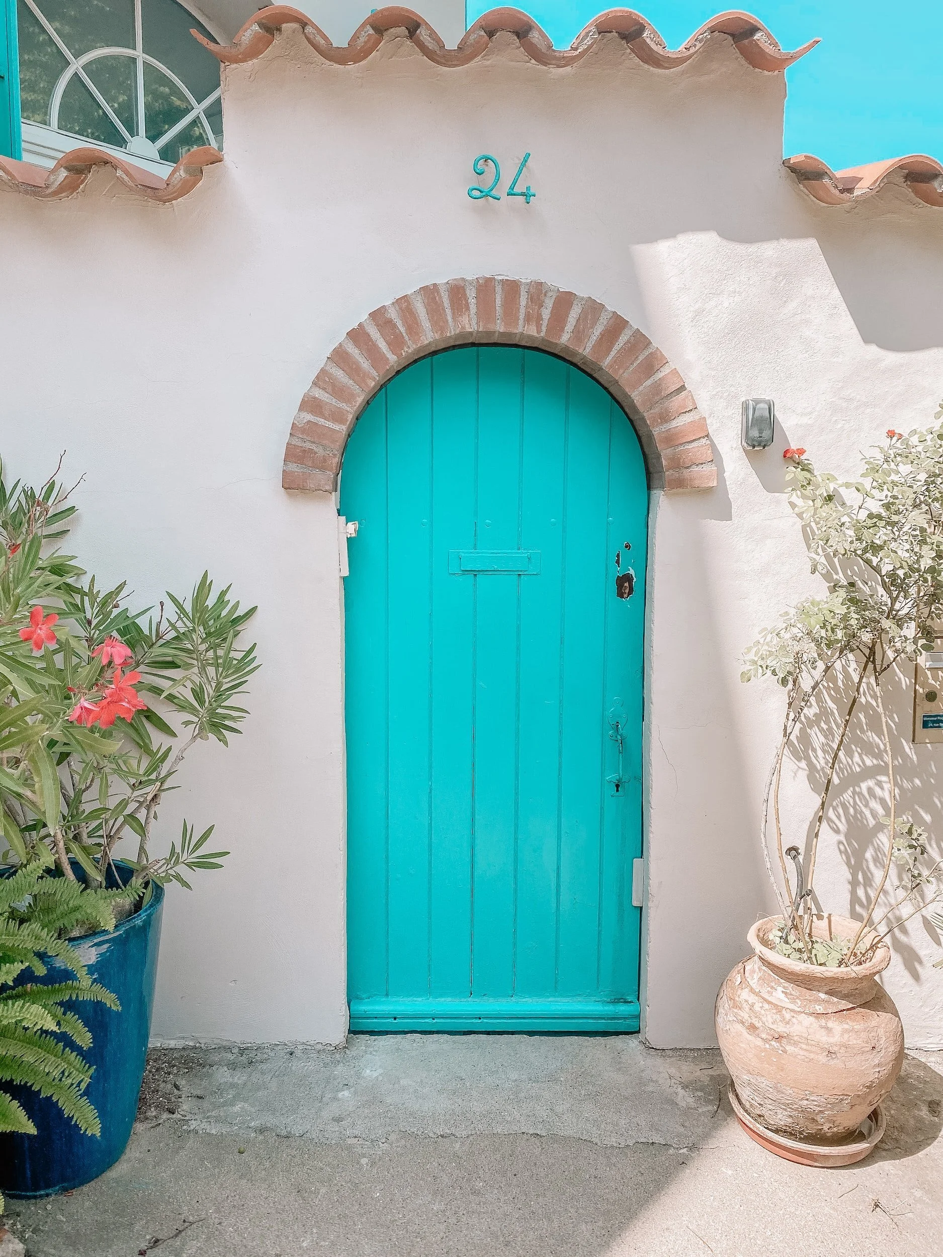
Teal and turquoise are dreamy, soft, elegant colours that lend themselves to travel and lifestyle brands. Light, bright tones of these colours are also commonly used in the electronics, sports, entertainment, communications, and creative sectors.
Which turquoise to use? Rich teal shows strength, efficiency, and integrity. While soft pretty Aquas can mean different things depending on the tone.
Key attributes: inspirational, clarity, calm, healing
Brand examples: Pampers, Canva, Deliveroo
Cool summery green/teal
Bright ‘spring’ teal, poppy vibrant
Yellow
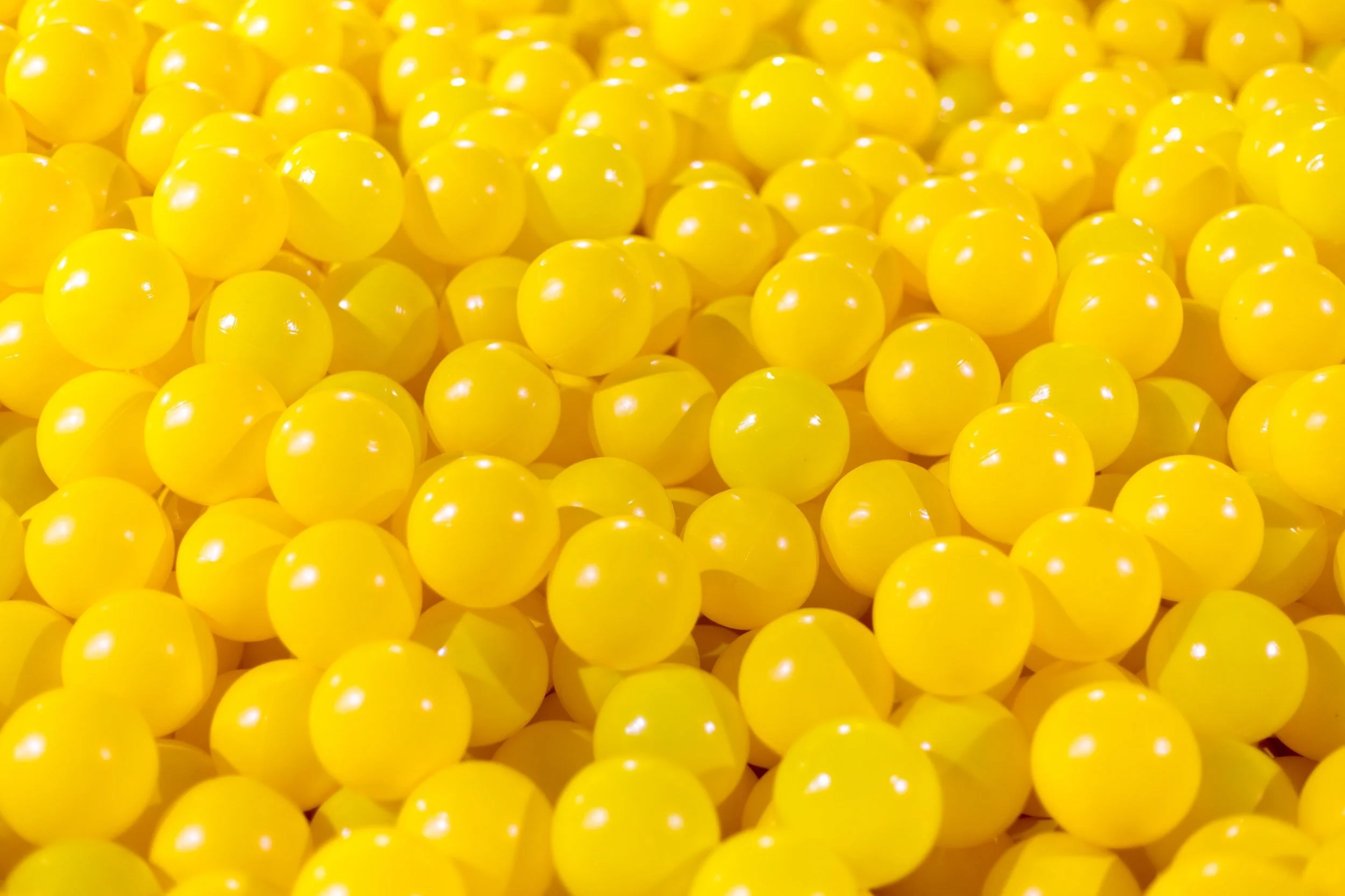
People associate yellow with the sun, and it evokes positive emotions – happiness, creativity, and optimism. Yellow is memorable, and brands tend to choose it to grab attention or stand out from their competitors.
Note: Certain shades of yellow and other light colours can be difficult to read on-screen.
Which yellow to use? A delicate buttercup yellow shows a supportive optimism. A warm, intense earthy yellow can evoke confidence.
Key attributes: happiness, optimism, friendliness
Brand examples: McDonald's, DHL, Hertz
This bright, stark, poppy yellow is perfect for a spring brand or perhaps a winter brand
This more muted yellow is reminiscent of summer when colours are more muted
Orange
Orange is a bright, energising, and playful colour that sparks creativity and joy when used correctly. Orange is said to activate brain activity and is a popular choice for brands who want to inspire their customers to be confident and take action.
Which orange to use? Pinky oranges add femininity to your palette, while oranges with red undertones will communicate strength and determination.
Key attributes: creativity, abundance, energy, comfort
Brand examples: Etsy, Amazon, Hubspot, Nickelodeon
Summery orange
Spring orange that pops
Red
Red is a standout colour that evokes a sense of urgency and attention. In marketing, it is known to increase heart rates, and it’s mostly used on impulsive shoppers. That’s why promotions and clearance sales often use this colour. It also stimulates appetite, which makes it perfect for fast-food restaurants.
Which red to use? Various reds, from spring pastels to vibrant winter reds, will evoke different feelings. Choose red with care.
Key attributes: assertive, strong, motivated, warm, passionate
Brand examples: Coca-Cola, Netflix, Pinterest, YouTube
Autumn reds
Summer red
Pink
Known as the colour of fun, youth and romance, pink is a fully charged colour favoured by bold, assertive brands worldwide. Pink, like its primary cousin, red, is considered a warm colour and, depending on the shade you use, can evoke a wide range of emotions from softness and innocence to attention-grabbing and loud.
Which pink to use? Soft, blush pinks show elegance and class. Hot pinks and neon are playful, lighter tones that are a little more “girlish”.
Key attributes: warmth, tranquillity, kindness, optimism etc.
Brand examples: T-mobile, Barbie, LG
Purple
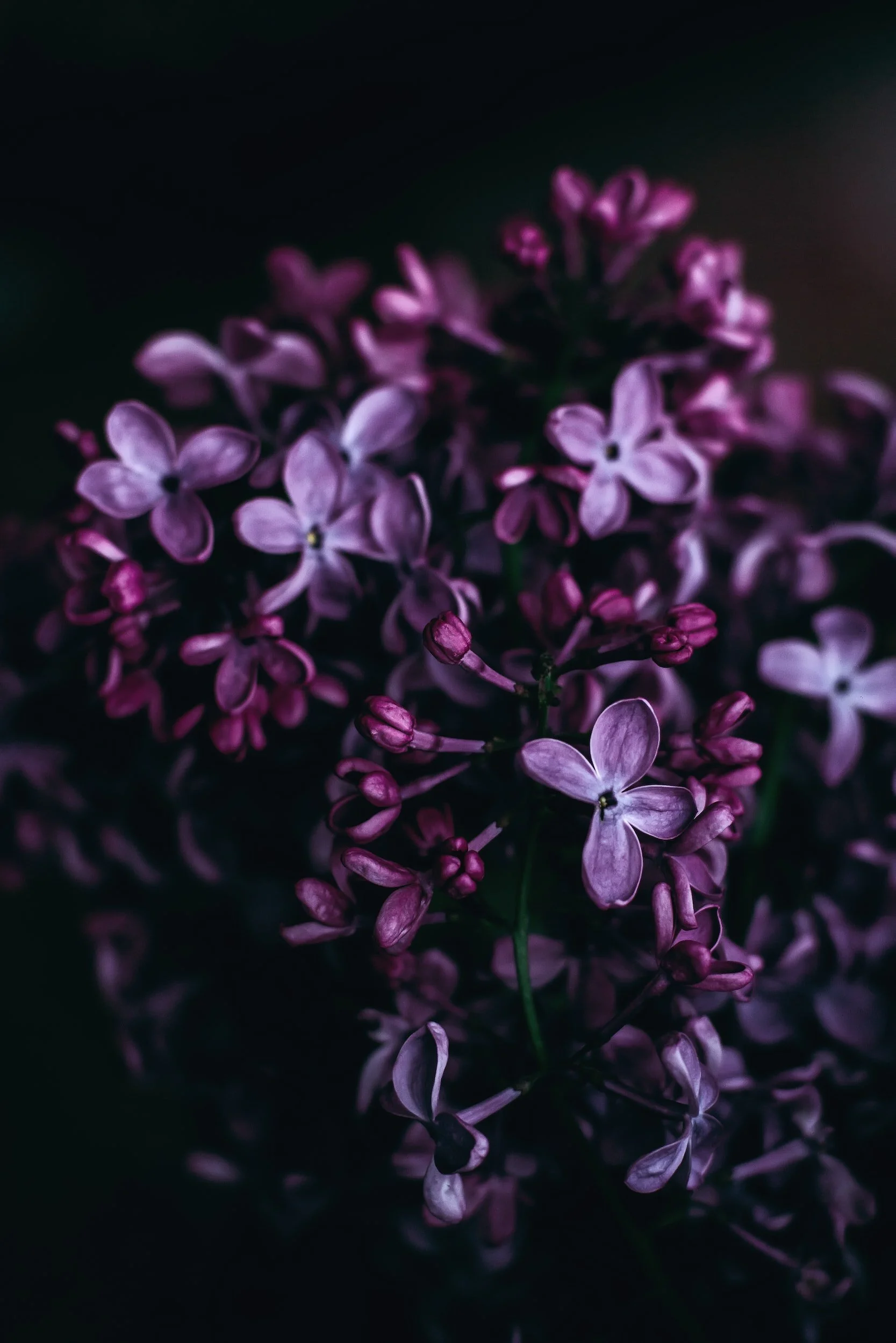
Purple is one of the rarest colours to appear in nature. That’s why it’s associated with uniqueness and is known as a royal colour. It implies respect, wisdom, and luxury, and it stimulates creativity.
Which purple to use? Deep purples show strength while also being approachable. A light violet shows spirituality. Soft, light purples are calmer and more serene.
Key attributes: visionary, purposeful, luxurious, authentic, spiritual
Brand examples: Cadbury, Hallmark, FedEx
Summer lavendar
Deep autumn purple
Brown
Brown is an excellent alternative to black and, as the colour of earth, has a natural, earthy, organic vibe. It helps to communicate ruggedness, strength, nature, and earth. People associate brown with quality, durable, and reliable products. We also often associate brown with wholesome, all-natural, or organic products due to its “outdoorsy” feeling.
Key attributes: grounded, stable, practical, honest, sincere, wholesome
Brand examples: UPS, Nespresso, Hershey's
Beautiful autumnal browns
Lighter summery cafe au lait browns
Gold
The colour gold can hold quite a few different meanings depending on your culture; however, across the world, it consistently represents some variation of charm, confidence, luxury, and treasure. Gold has a tremendous reputation for showing success and adding a certain level of validation to a brand when used correctly. Businesses might use gold in their packaging or print material design to indicate that their offer is top-of-the-line.
Note: While gold can add a sense of luxury to printed materials, it doesn’t really work digitally.
Key attributes: wealthy, opulence, successful, wise, generous, royal
Brand examples: Lór, Lindt, Cartier
Silver
Silver is a modern colour that encourages visions of a futuristic tomorrow.
Silver has traditionally been viewed as a distinguished colour associated with wealth, modernity, glamour, grace and elegance. As a metal, silver also represents that which is innovative, refined, sleek and sophisticated.
Note: Again, like Gold, silver doesn’t shine best on websites and is best used in offline applications.
Key attributes: dignified, wealthy, balance, and calming.
Brand examples: Apple, Mercedes Benz, Audi
White
White is the colour of purity and is classically associated with simplicity and safety. It’s also the symbol of intelligence, professionalism, and cleanliness. That’s why doctors and scientists wear white suits. Companies can also use white to show they are creative since it can represent a new beginning, a blank slate, and space for fresh, new ideas.
Key attributes: clean, pure, simple, efficient, hygiene, sophistication, efficient
Brand examples: Uber, Chanel, BBC
Black
Black can be a double-edged sword when used in branding. In some cultures, black can represent evil, darkness and death. Black can also represent power, tradition, elegance, and sophistication. Companies often use black for high-end products or to promote a sense of luxury or mystery. Black is a very reserved colour that completely lacks any light as its an absence of all the colours. It likes to stay hidden, in control, and separate from others. For this reason, black is an excellent colour for high contrast and easy legibility. When it comes to your colour palette, using pure black should be reserved for “winter” brands. Alternatives to explore include dark grey/charcoal, dark brown, racing green, and navy blue.
Brand examples: Nike, Sony, ASOS
Finding your brand colour palette
Your brand’s visual identity strongly influences how the world perceives your business. And colour is one of the most essential components of visual identity.
Choosing the right mix of colours can make or break your branding.
Get it right, and colour can help your audience see what you want them to see, feel what you want them to feel and do what you want them to do. Get it wrong, and your brand can appear colourless and drown in a sea of brighter competitors.
My recommendation? Using the “Seasonal Personality Framework”, root your palette in one season, and you’re more likely to have a cohesive, harmonious palette that works commercially.
If you feel your brand colours don’t properly represent your business, book a free Discovery Call today to discuss how I can design a visual identity for your brand that feels like your business.
