Pyschologist Brand Strategy & Design | Designs For Growth | Dublin
Dr. Michela Devaney Chartered Psychologist | Emotion-Focused Therapy | Neurodivergent Adult Specialist
How we repositioned a chartered psychologist from a generic practice name into a precisely positioned, credential-led brand built for a specialism almost no one in Ireland is offering clearly.
The work was delivered through the Brand Authority Method™ - my six-step framework that runs strategy, visual identity and digital design build from the same strategic foundation.
For Michela, this engagement covered the first two steps: brand strategy and visual identity. The website design and build is the next phase, to follow when Michela is ready to continue.
The Starting Point
Michela Devaney came to this engagement with something most practitioners spend years trying to build: a genuinely rare clinical position, a body of lived experience that directly informed her work, and a clear sense of the practice she wanted to create.
What she didn't have was a brand that said any of it.
She was trading under a practice name that was personal and meaningful to her, and invisible to everyone else. It obscured her doctorate entirely. It described her as a counsellor when she is a chartered psychologist - a meaningful distinction clinically, professionally, and commercially. And it gave no signal of the specialism that makes her work distinctive: emotion-focused therapy, adapted for neurodivergent adults, delivered by a practitioner with lived experience of neurodivergence herself.
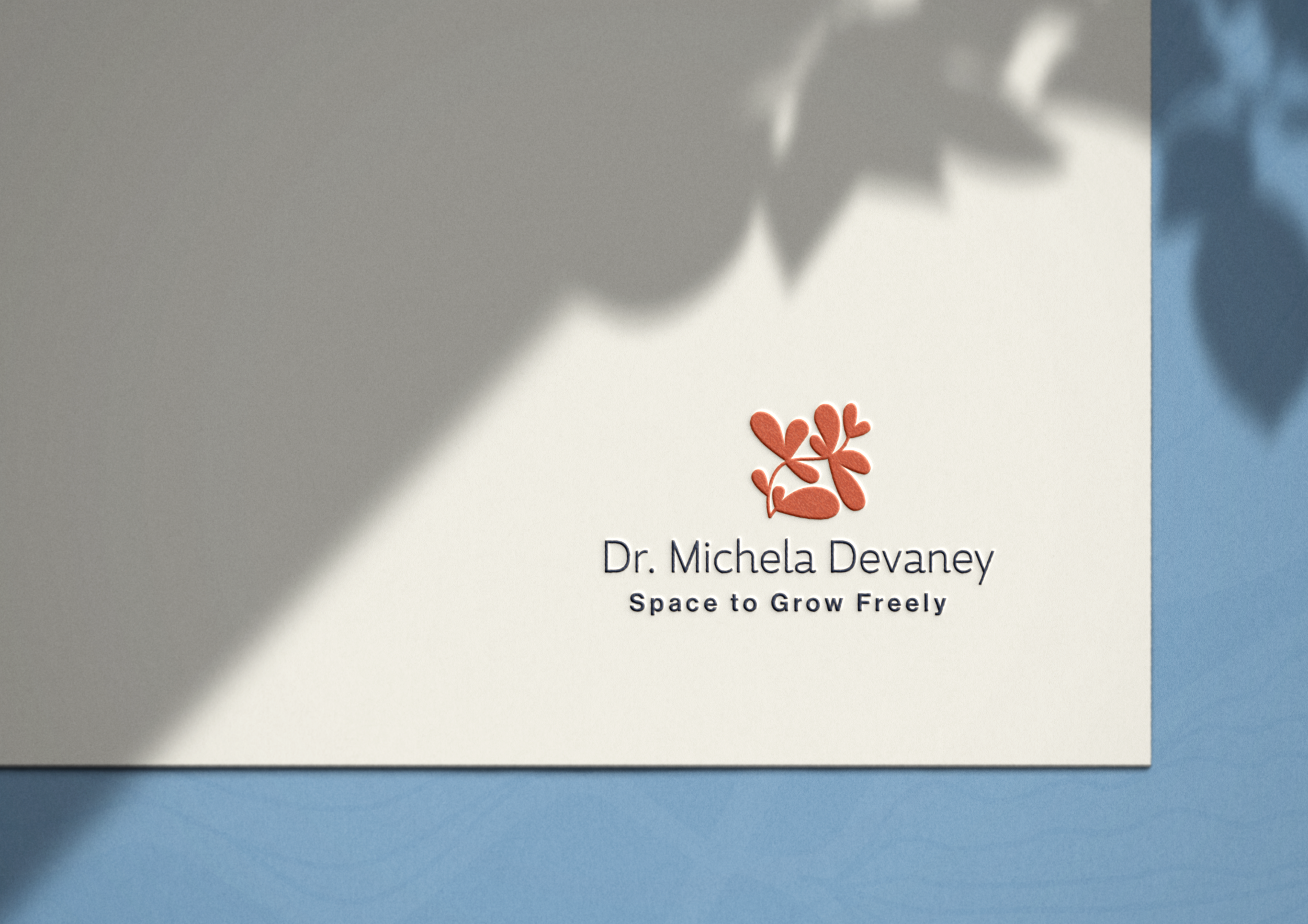
The rebrand moved her to her own name. Dr. Michela Devaney. The doctorate in the first word. The rest of the work built from there.
Step 1: Brand Strategy
The strategy stage runs across five focused sessions covering Purpose, Personality, People, Positioning and next-steps planning.
Purpose
Michela's purpose is precise: to help neurodivergent adults develop deeper self-acceptance and build lives that feel emotionally grounded and meaningful. What shapes that purpose is not just clinical training but lived experience. Her neurodivergence is not a footnote — it is a lens through which she understands the people she works with, and it changes the nature of the therapeutic relationship in ways that matter to clients who have spent years feeling misunderstood.
The belief that emerged as the brand's organising principle: emotions are not a problem to manage. They are a compass. That sits at the centre of everything Michela does, and everything the brand says.
Personality
The central tension to resolve was holding warmth and clinical authority in the same voice. Too clinical, and the safety signal neurodivergent clients specifically need disappears. Too soft, and the professional credibility that distinguishes her from the wider therapy market gets lost. The brand personality landed between the two: warm and grounded, quietly confident, deeply respectful without being deferential.
People
Michela works with two distinct groups — college-age adults navigating identity and diagnosis, and midlife professionals who have spent years masking and managing. Different clients on the surface. Underneath, the same core experience: a lifetime of feeling too much, and never finding a space where that was met with understanding rather than management. The brand was built around that shared emotional truth. One positioning, two audiences, one door.
Positioning
Michela's position is specific and genuinely underserved. Most practitioners are either EFT specialists working with general populations, or neurodivergent-informed therapists using integrative approaches that don't include EFT. Michela sits at the intersection — and adds lived experience that almost no competitor can claim. That intersection became the position, named precisely enough to be found by the people who need exactly what she offers.
The longer-term vision shaped the positioning too. Michela is building toward a professional network, public speaking and thought leadership in neurodivergent wellbeing. The brand was built to carry that ambition — positioning her as an emerging authority, not only a clinician, so the next version of the practice has somewhere credible to stand.
Next-Steps Planning
Three priorities: the rebrand, the website, and more intentional marketing built on a name and identity that could be searched, found and understood by the right clients before they make contact.
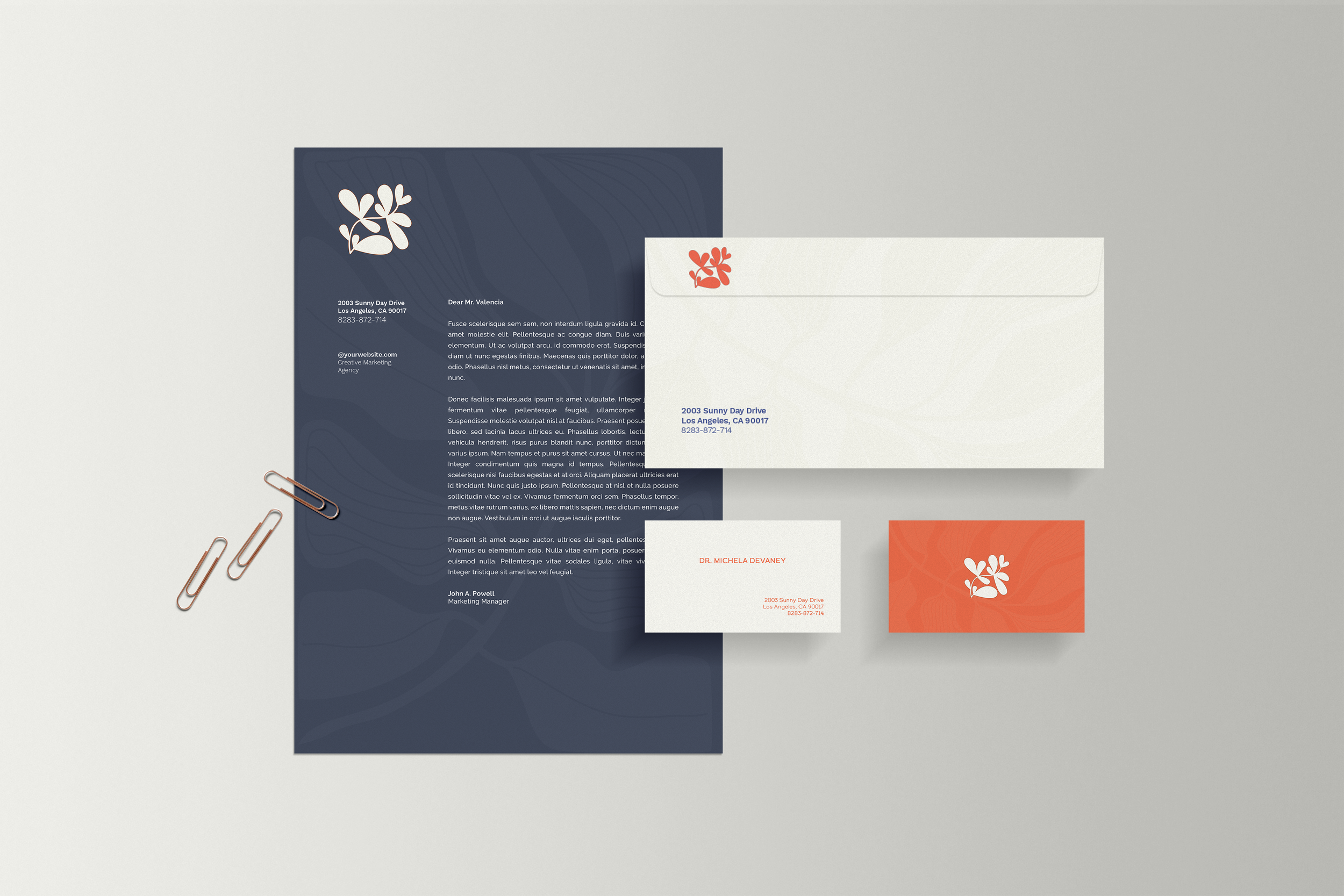
Step 2: Visual Identity Design
The visual identity work began inside the Positioning session, with the brand promise translated into visual direction.
The emotional truth at the centre of the brand - that a neurodivergent person deserves a space where their inner world is treated as something to understand rather than fix - gave us the visual metaphor: growth that doesn't conform to a single shape. Reaching in multiple directions at once, which is exactly how a neurodivergent mind works.
The mark is botanical: organic, hand-cut shapes in terracotta that suggest growth without announcing it. Navy type. A cream ground. Professional and human in equal measure, and distinctly non-clinical. The tagline Space to Grow Freely holds the therapeutic intent without leaning into cliché.
What the Brand Strategy Was Built to Solve
👉 Visibility under the right name. The previous name could not be searched, found or understood by someone who didn't already know Michela. Dr. Michela Devaney puts the doctorate first and gives the specialism somewhere to live that referrers and search engines can work with.
👉 Credibility at first glance. The qualification, the specialism and the lived experience were all present in the work and invisible in the brand. The strategy made the credential the lead and built the positioning around the specific intersection that makes the practice rare.
👉Room for the next version. The new brand is built for where Michela is going — a practice with ambition beyond the therapy room — not where she started.
What Changed
Before. A doctorate invisible in every public-facing surface. A clinical position - one of the most specific and underserved in Irish psychology - entirely unarticulated. A brand that could not be found by the people who needed it most.
After. A name that leads with the credential. A position precise enough to be found, understood and referred. A visual identity that holds professional authority and human warmth in equal measure. A brand built for a practice with ambition beyond the therapy room.
The website - where the positioning and identity will come together fully - is the next phase of the engagement.