
How to Improve Your Website Navigation: 9 Essential Best Practices
Website navigation can make or break your visitors' experience.
Why? Well, let's imagine we are in their shoes for a moment…
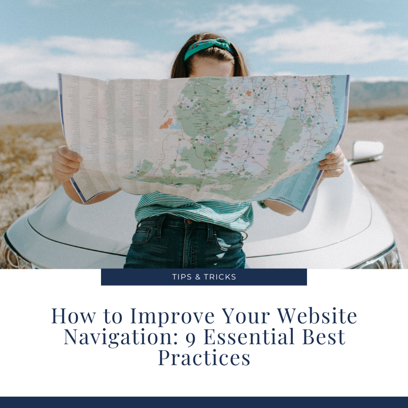
Attempting to navigate a website without a clear, guided, logical path is like being dropped in the middle of a complex maze without a map or any frame of reference. It's overwhelming, frustrating, and all-around confusing — not exactly the dream user experience, right?
So, what can we do to ensure a seamless journey for our customers that keeps them on our website and returning for more? It starts with a clear website design with easy, friction-free website navigation.
But firstly, what is website navigation?
As the name suggests, website navigation is a way to show the importance and relevance of specific pages, content, and information on a website. It’s also a vital way to help users find the content they want to see.
Website navigation can show up in different ways, including sidebars, header/banner menus, call-to-action buttons, footer information, search bars and hyperlinks.
Why seamless website navigation matters
When your navigation is clear and consistent, it improves the user experience and the likelihood of conversion. This is because you're more likely to drive traffic to the correct pages – so your visitors go precisely where you want them to go.
Website navigation is also hugely important for SEO as it gives your site a structure and helps search engines "understand" your site – helping you to rank higher.
And if that wasn't enough, your website navigation also affects virtually every other success factor of your website:
Lead generation - through clear call-to-action buttons and boosted usability
Messaging- short yet descriptive menus help communicate your brand positioning & core offers
Analytics - poor navigation structure can make measuring user flows difficult
Website updates- complicated menu styles are harder to update
Accessibility- some menus are more difficult for users with specific impairments
Website navigation tips from a website designer
Often when a client approaches me with website traffic or conversion woes, in many cases, it's down to poor design and confusing website navigation. Here are 9 best practices to help you avoid these common navigation pitfalls:

Website navigation tips
9 best practices for friction-free website navigation
Start with a sitemap
When it comes to website design (and, particularly, menu navigation), step one is to figure out what kind of features/pages the website will offer and the hierarchy in which information should be displayed. A sitemap is a visual structure of your website navigation. Creating a sitemap can clarify and inform your decision-making when designing your website navigation. It gives you a clear view of page hierarchy and importance.
Don't reinvent the wheel
While it's tempting to break the mould; there are times when it's best to stick to best practices. After all, there's a reason why a logo usually appears in the top left hand corner of a website or why hyperlinks generally appear blue. These familiar nuances, or design conventions, exist because they work. You want visitors to glide seamlessly through your website. So, while I encourage letting your brand's identity shine, I always recommend emphasising clarity over aesthetic boldness. That means using familiar language, clear menu labels and, where possible, ditching the jargon!
Keep it simple (and clean!)
Clean design & clear navigation go together hand in hand. When it comes to your navigation font, for example, bigger is not necessarily better - it does not need to size 16 to be impactful. Instead, ensure it aligns with the rest of your site design and business branding. Avoid clutter, and offer plenty of white space throughout your website to allow the reader's eye time to breathe. Confused, overwhelmed customers do not convert.
Choose the menu layout wisely
Not everyone will reach your site from its homepage, so any page they land on should easily connect to the rest of your site. An easy solution is ensuring that all pages are accessible from the main menu, and each includes a menu. Items that appear first or last on any list are most effective. Navigation is no exception. Put your most important content at the beginning of the navigation and ensure that your primary navigation (a.k.a, the things you want the user to notice and the things that will actually make a difference to your business) stands out.
Use your logo as your anchor
One of the biggest misconceptions I come across as a website designer is that your menu needs to include the word "Home"—quite the contrary (in fact, if it does, it may appear outdated!). Instead, add your logo at the top of your website and link it to the homepage. I always ask my clients if they see "Home" on the Amazon website navigation. No, you don't. Generally speaking, users know to click on your logo. If this worries you (it concerns a lot of my clients!), add a “Home” link in your footer navigation.
Speaking of footer navigation, use it!
Your footer navigation is just as powerful as your primary header navigation; however, unfortunately, it’s usually the most under-utilised. These days, users know instinctively to check out your footer for other content too. That is where I recommend putting your policy pages, FAQ page, contact page, blog or any pages that may not be driving direct results/sales/engagement for your business.
Add a search bar
Have you ever landed on a website with a focused idea of what you're looking for but have been unsure where to find it exactly? You might have scrolled down the page a bit or skimmed the menu, but ultimately, you can't find that blog/product/FAQ you had in mind. Frustrating, right? The good news is that you can remove this barrier for your visitors by adding a search bar functionality. Above all, your search bar should be simple, obvious and easy to use. In fact, if it works well, your users won't even think about it. You'll gain their trust and, in turn, entice them closer to a conversion or purchase.
Include clear Calls-to-Action
Call-to-action (CTA) buttons are used throughout a website to guide users toward a particular action. Some aim to instantly convert users, while others serve as valuable stepping stones throughout a user's journey on a website. I recommend placing at least one call-to-action button within the header menu so visitors can access this when needed. However, CTAs should also be dotted strategically throughout your website when appropriate, as the header CTA might not be relevant to all users.
Don't forget about mobile
It's clear: we live in a mobile-first world. In fact, according to 2022 Statista reports, mobile accounted for approximately half of the web traffic worldwide! Historically, website navigations included everything on a site within long, multi-tiered lists. On mobile, that approach just doesn't work. It looks cluttered, requires scrolling, and causes your visitors to leave. For mobile responsive navigation, I recommend keeping the navigation menu simple (designing with touch in mind), linking the most important pages first and using clear, easy-to-read fonts and colours.
Final thoughts
No matter what type of business you have, people visit your website to DO something - whether it's to make a purchase, read a blog, or find out more about you and your offer. Navigation is what helps them find their way. Don’t abandon them in a maze — hand them a map!